SEO & AEO Strategy
Reach Customers Who Are Ready to Buy Right Where They Search

Reach Customers Who Are Ready to Buy Right Where They Search
UX design improves how visitors move through your website, making pages clear, simple, mobile-friendly, accessible, and conversion-focused so users find answers quickly and confidently online.
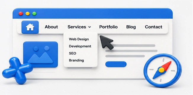

Easy navigation helps visitors find services, pages, contact details, and important information quickly, reducing confusion, improving engagement, building trust, and guiding users toward meaningful actions with confidence online every time.
Mobile usability ensures your website works smoothly on phones and tablets with readable text, fast loading, simple buttons, responsive layouts, and clear actions that support every visitor anywhere online today.
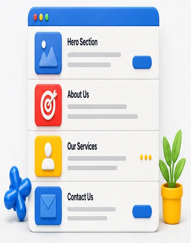
Clear page sections organize content into readable areas with strong headings, focused messaging, helpful visuals, and logical flow so visitors understand information faster and stay engaged longer online easily confidently.
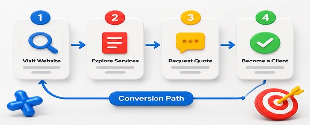
Conversion paths guide visitors from interest to action using strategic messaging, trust signals, forms, buttons, and follow-up steps that turn website traffic into qualified leads, sales, and appointments consistently online.
An in-depth UX design strategy maps user needs, simplifies navigation, improves mobile usability, reduces friction, and guides visitors toward conversions.
Topic | Thought |
|---|---|
Main Menu | Simple menus help visitors find pages quickly without confusion online. |
Clear Labels | Clear labels tell users exactly where each navigation link leads. |
Footer Links | Footer links support discovery when visitors reach page endings naturally. |
Search Feature | Site search helps users locate answers, products, and services faster. |
Breadcrumb Trails | Breadcrumbs show location and help users move backward easily anytime. |
Menu Order | Prioritized menus place important pages where visitors expect them first. |
Sticky Header | Sticky headers keep navigation visible while visitors scroll important content. |
Dropdown Structure | Organized dropdowns reveal choices without overwhelming users with excessive options. |
Clickable Buttons | Clickable buttons make navigation actions obvious, accessible, and visually clear. |
User Testing | Testing reveals navigation problems before visitors experience frustration or confusion. |
Topic | Thought |
|---|---|
Responsive Design | Responsive design keeps pages functional across all mobile screen sizes. |
Touch Targets | Large touch targets help users tap buttons accurately and comfortably. |
Fast Loading | Fast loading keeps mobile visitors engaged and reduces quick exits. |
Readable Text | Readable text improves comfort for users browsing on smaller screens. |
Mobile Forms | Short mobile forms reduce effort and improve successful submissions online. |
Thumb Navigation | Thumb-friendly navigation makes common actions easier on mobile devices. |
Image Scaling | Proper image scaling prevents awkward cropping and slow mobile loading. |
Mobile Menus | Simple mobile menus help users reach important pages without frustration. |
Click-To-Call | Click-to-call buttons help mobile users contact businesses instantly with ease. |
Device Testing | Testing devices ensures layouts work smoothly before customers experience issues. |
Topic | Thought |
|---|---|
Section Headings | Clear headings help visitors understand each page section quickly online. |
Visual Dividers | Dividers separate content areas and make pages easier to scan. |
Content Blocks | Organized content blocks keep information focused, readable, and visually balanced. |
White Space | White space reduces clutter and improves attention on important messages. |
Service Sections | Service sections explain offerings clearly without overwhelming visitors with details. |
Benefit Areas | Benefit areas highlight outcomes customers care about before choosing services. |
Trust Sections | Trust sections showcase proof, reviews, credentials, and credibility signals. |
FAQ Sections | FAQ sections answer common questions and reduce customer hesitation effectively. |
Layout Flow | Logical layout flow guides visitors from information toward action smoothly. |
Section Balance | Balanced sections keep pages professional, readable, and visually consistent throughout. |
Topic | Thought |
|---|---|
Lead Pathways | Lead pathways guide visitors from interest to contact forms smoothly. |
CTA Placement | Strategic CTA placement encourages action when visitors feel ready online. |
Quote Requests | Quote request paths make pricing conversations easier to start quickly. |
Booking Flow | Simple booking flows help customers schedule services without unnecessary steps. |
Checkout Steps | Streamlined checkout steps reduce abandonment and improve completed purchases online. |
Contact Options | Multiple contact options let customers choose their preferred communication method. |
Trust Before Action | Trust signals before actions reduce doubt and increase conversion confidence. |
Form Simplicity | Simple forms collect needed details without discouraging potential customers online. |
Follow-Up Paths | Follow-up paths keep prospects engaged after their first website action. |
Goal Completion | Clear completion steps reassure users their action was successful online. |


Hello@marketer.com
2912 Meadowbrook Road, Los Angeles, CA 90017